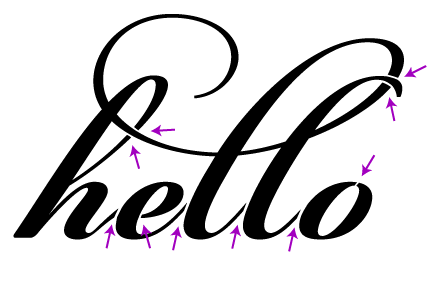
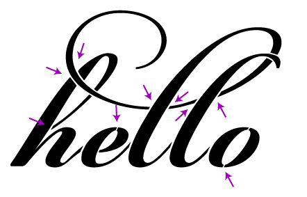
One of the critical pieces of making a design work in the physical work is paying attention to bridges — paths that cross gaps in your design to hold it together. A potential client is working on a gatefold envelopment for an invitation. She’d like to have some text cut out of the gatefold; that is, the text is negative space. We start our design by just typing in the text:

Without any changes, we’d end up with something like this:

Now it’s obvious that some bridges need to be added to the design. We’ll start by adding bridges (or rather, removing part of the design) to connect every island, like so:

Now the design looks like we intended when cut:

However, there is still a problem. Imagine taking your finger and pushing on different parts of the cut piece, for example, the middle of the “o”. This piece is quite floppy, making it likely to shift around, get pushed in and out and ultimately tear off. We could make the bridges really wide, but we risk throwing off the balance of the design or ruin the legibility. To reinforce the islands, we instead add more bridges:

Finally we have a design that looks good and is structurally sound:

I am of course happy to take your money in exchange for doing this work for you. I’ll make the needed changes, cut a physical prototype, photograph it for your approval, and send back the modified file.