How to improve a laser cut greeting card or stationery design

It’s surprising when a design that looks great on screen falls apart or looks completely different when laser cut. I hope you can learn from my overflowing “prototype” box by observing a few guidelines.

Print the design on paper.
When working on screen it is easy to lose touch with the scale of a design. Print it out and eliminate or thicken small design elements.

Imagine your design bending in the physical world.
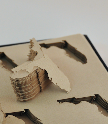
Cardstock is flexible enough that thin or unsupported elements may bend or flop over. Watch for elements that can catch on envelopes or the laser bed.

The image below shows an example. When the design is first cut it looks fine. The second panel shows a weak spot; it is too easy for the design to bend out of shape. In the third panel the design has been improved by adding tiny bridges to the weak spot.

Adding small supports to a laser cut card will improve its robustness

Reduce the total line length.
Think of measuring the length of a coastline. If you drew it by walking the beach adding every detail you would end up with a distance many times greater than if you drew it from a birdseye view. Try smoothing out your lines or offsetting the path to remove excess detail. On an X-Y laser, the distance the laser head travels has a close correlation to the cost.

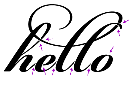
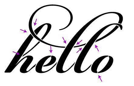
Shadows will change how your design appears.
Particularly, the contrast on small cut areas with be greatly reduced and lines will appear thicker than on screen. In the image below the small cutouts have lost their high-contrast effectiveness compared to the original art. The thicker the paper the more pronounced this effect becomes.

Small laser cut details can become obscured because of shadows

Check your compound paths & mind the kerf.
Releasing compound paths may reveal problem areas that need to be bridged. Precise designs should use offset paths to account for the kerf of the laser beam.

If lining your card, leave room for adhesive.
If your design has large cut areas, you will likely want to line it with paper to ensure that the writing on the inside of the card doesn’t show on the outside. If you are using glue or a tape gun make sure to leave the width of the tape line plus some slop.

Prepare for higher failure rates with many small cutouts.
The airflow in the system may cause small cutouts to blow onto uncut portions of the design. If the double thickness causes a skipped area then the small blip may be salvaged with an Xacto knife. Alternatively, if both layers are cut and smoke gets trapped you may try gently erasing the smoke.

Consult an expert
I have made hundreds of stationery designs laser ready. Sometimes the art just needs minor adjustments and other times cut & photographed prototypes are necessary. When working to a budget I can make suggestions early in the design phase.

Candyspotting specializes in laser-cut paperContact me for a free estimate.

Running slow: eliminating wobbles

There is a trade off between speed and quality with x-y laser cutting. This 80# cardstock test shows a slow run on the left and a fast run on the right. To get the best results I run the laser at a slow speed; it ensures very smooth curves and a close representation of the original art.

At a fast speed the laser beam carriage runs with some wobbles. If this loss in accuracy is acceptable for your project please let me know. Depending on the circumstances it may lower the cutting cost 10-50%.

Freshly Cut – Little Floridas for cevd

Cut from Arturo in Grey

Christine’s studio cevd designs beautiful custom invitations.

These little Florida cut-outs will become part of an invite.

The cotton Arturo paper was a dream to cut. There was virtually no odor or surface discoloration from the heat of the beam.

I’ve recently added a set of cotton and bamboo papers from Legion to my swatch catalog. Let me know if you’d like to see a sample.

More photos are on flickr.

Common bridge problems

One of the critical pieces of making a design work in the physical work is paying attention to bridges — paths that cross gaps in your design to hold it together. A potential client is working on a gatefold envelopment for an invitation. She’d like to have some text cut out of the gatefold; that is, the text is negative space. We start our design by just typing in the text:

Without any changes, we’d end up with something like this:

Now it’s obvious that some bridges need to be added to the design. We’ll start by adding bridges (or rather, removing part of the design) to connect every island, like so:

Now the design looks like we intended when cut:

However, there is still a problem. Imagine taking your finger and pushing on different parts of the cut piece, for example, the middle of the “o”. This piece is quite floppy, making it likely to shift around, get pushed in and out and ultimately tear off. We could make the bridges really wide, but we risk throwing off the balance of the design or ruin the legibility. To reinforce the islands, we instead add more bridges:

Finally we have a design that looks good and is structurally sound:

I am of course happy to take your money in exchange for doing this work for you. I’ll make the needed changes, cut a physical prototype, photograph it for your approval, and send back the modified file.

Freshly Cut – Amanda & Nate’s Wedding Invitations

Cut from Paper Source in White and Stardream in Rose Quartz with coordinating 5 3/4” square envelope. Ink-free etched text.

My brother-in-law Nate was recently married to his high school sweetheart Amanda and I was delighted to design their wedding invitations.

A vinyl aficionado, Nate brought up the idea of making a mock-record invitation. I photographed and emailed several choices of paper to match their pink and white theme and they went with my favorite, a pearlescent rose. Spending some time on record sleeve production websites I came up with a good template that just required two strips of adhesive.

Perfecting the etching took the longest amount of time. I ultimately developed a technique that first etches the text, then finely outlines it to increase the contrast.

Heartfelt congratulations to the newlyweds. It was a joyous wedding with many sweet details.

If I made this invitation again I would make a few improvements. First, I’d change the font for the date. Perhaps adding bridges to the font used for the monogram would be enough. Second, I’d reverse-cut the sleeve so that the slight yellowing of the paper around the cuts would be on the inside instead of the outside. When I first did the cut it looked great; it wasn’t until a week or so later that the discoloration showed. Last, the white paper etched great (I tested at least eight whites from several mills) but it didn’t feel quite solid enough. It was somewhere in the 80-100# range; 120-140# would be much more record-like.

More photos are on flickr. This design is available to be customized for your special event from $5 an invite. I’m happy to work with your design or a third party designer as well, just email for more information or a quote.