Cutting OSBP’s logo: behind the scenes

http://www.youtube.com/watch?v=8V3Qbh3C32w?rel=0

I was delighted to have Carina of Crow & Canary swing by the workshop last week to take some photos for a guest post on Oh So Beautiful Paper. Here’s what it took to prepare the OSBP logo, with calligraphy by Bryn Chernoff, to be cut.

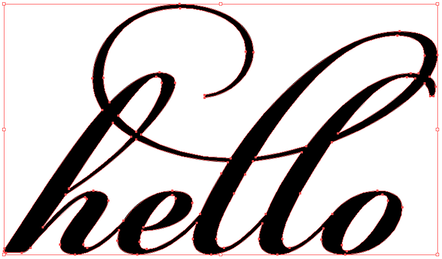
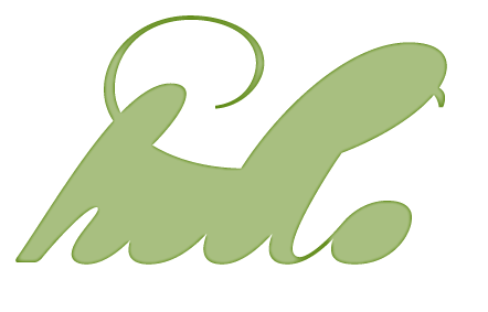
Here is the original logo:

Original version of OSBP logo

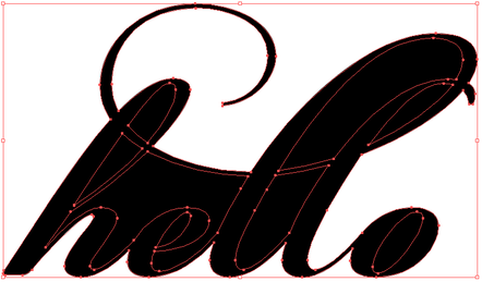
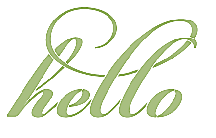
and here is the laser-ready version:

The OSBP logo prepared for the laser

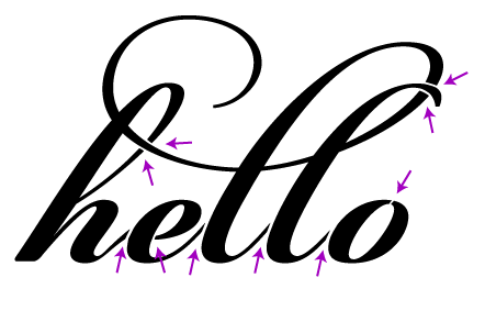
The original logo would cut as several separate pieces (“O” “H” “S” “O” “Beautiful” “P” “aper” and the dot of the “i”), so the first thing I did was tie everything together. I start with a frame that the words will be bridged to:

OSBP logo with a simple frame

The straightforward solution to bridge the text is to add a rectangle that intersects each text baseline. Tall portions of the design might flop over when the paper is held upright, so those need to be secured as well.

OSBP with lines added to bridge to the frame

Unfortunately, this doesn’t fit with the aesthetic of the logo and the long start to the “P” is likely to sag. Instead, I decided to pull everything together with some well placed curves.

OBSP tied to the border with curves

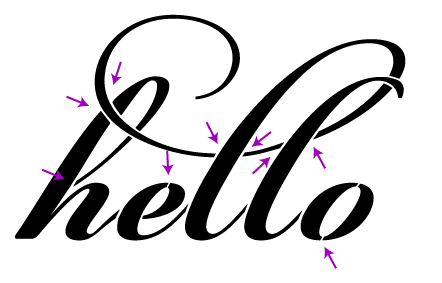
Next, all of the black portions of the image are unioned together. The correct line width and color are selected for compatibility with the laser, the path is offset to adjust for the kerf, and a test cut is made.

The test cut revealed a few weak spots so the paths were tweaked and it was ready to go. The video took several takes; I’m a video novice so it took a while to get reasonable depth of field with the low light in the workshop.

Please let me know what topics you’d like to hear more about. I’ve been working on an FAQ for the site that touches on several areas that could be addressed in more detail. Thanks for reading!

Determining what to bridge

Here are three quick ways to determine what portions of your design need bridging.

In Illustrator:

  1. Select All
  2. Object -> Compound Path -> Release

This converts all of the closed paths of your design into their own objects. Now we can clearly see which pieces will be left on the laser bed, like so:

In Acorn, Photoshop etc:

  1. Eyedropper the color from your image
  2. Flood fill the background

All of the white portions need bridges.

To see what will actually be cut out, as with the Illustrator version:

  1. Use the magic wand to select the background
  2. Select -> Inverse (note: menu items may differ in Photoshop)
  3. Edit -> Fill
  4. Clear the selection

Common bridge problems

One of the critical pieces of making a design work in the physical work is paying attention to bridges — paths that cross gaps in your design to hold it together. A potential client is working on a gatefold envelopment for an invitation. She’d like to have some text cut out of the gatefold; that is, the text is negative space. We start our design by just typing in the text:

Without any changes, we’d end up with something like this:

Now it’s obvious that some bridges need to be added to the design. We’ll start by adding bridges (or rather, removing part of the design) to connect every island, like so:

Now the design looks like we intended when cut:

However, there is still a problem. Imagine taking your finger and pushing on different parts of the cut piece, for example, the middle of the “o”. This piece is quite floppy, making it likely to shift around, get pushed in and out and ultimately tear off. We could make the bridges really wide, but we risk throwing off the balance of the design or ruin the legibility. To reinforce the islands, we instead add more bridges:

Finally we have a design that looks good and is structurally sound:

I am of course happy to take your money in exchange for doing this work for you. I’ll make the needed changes, cut a physical prototype, photograph it for your approval, and send back the modified file.