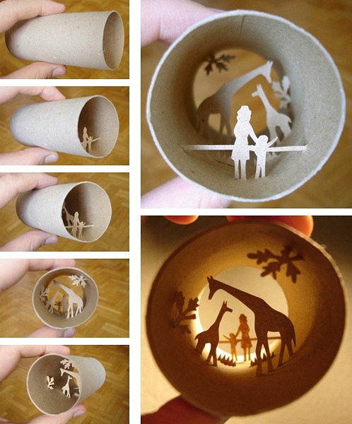
Beautiful toilet paper roll art by Anastassia Elias. (via)
I cut paper with lasers
Beautiful toilet paper roll art by Anastassia Elias. (via)
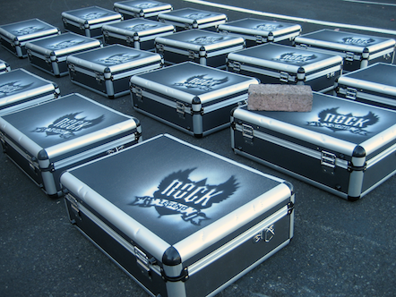
Brian of Behrens Group was commissioned by Make Animals and Opus Solutions to make some ”road cases” as part of Intel’s Rock Legend program. He was on a deadline so there wasn’t time to shop for materials; we used some 1/8” acrylic I had on hand. The art cut out well and the stencil worked great. Unfortunately the spray paint would build up on the stencil after a few uses so he had to laboriously clean it several times. Next time we will cut several copies out of matboard so that the cleaning step can be eliminated.
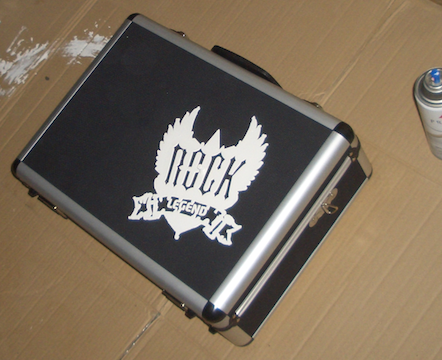
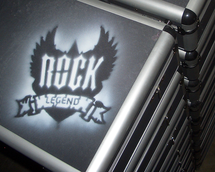
Photos graciously provided by Behrens Group.
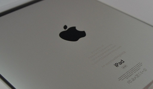
Etched iPad for Apparent Systems. They’re rolling out a bunch of these pre-loaded with a test version of their latest app.
The etching was pretty straightforward. I used my old iPhone as a material sample to get the settings right. Although it’s just an id mark the etching is quite lovely in person.
Time-lapse video of paper-cutting genius Rob Ryan and crew at work. (via)
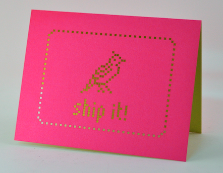
A custom card to congratulate the launch of my friend’s Mac Twitter client Hibari. Give the free trial a whirl and keep the tweet firehose under control. Cut out of Sorbet duplex watermelon/kiwi.
Cut from Arturo in Grey
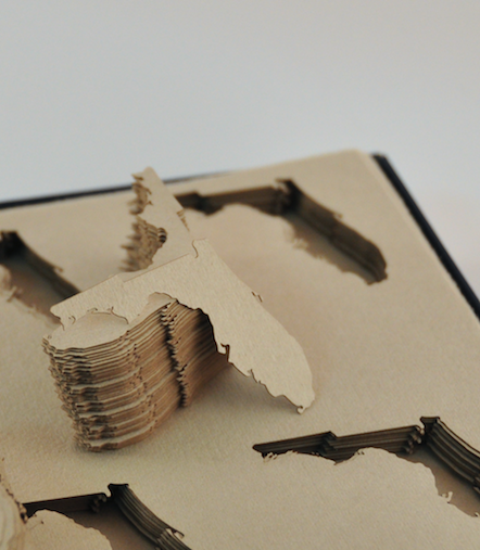
Christine’s studio cevd designs beautiful custom invitations.
These little Florida cut-outs will become part of an invite.

The cotton Arturo paper was a dream to cut. There was virtually no odor or surface discoloration from the heat of the beam.
I’ve recently added a set of cotton and bamboo papers from Legion to my swatch catalog. Let me know if you’d like to see a sample.
More photos are on flickr.
Here are three quick ways to determine what portions of your design need bridging.
In Illustrator:
This converts all of the closed paths of your design into their own objects. Now we can clearly see which pieces will be left on the laser bed, like so:
In Acorn, Photoshop etc:

All of the white portions need bridges.
To see what will actually be cut out, as with the Illustrator version:
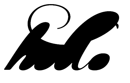
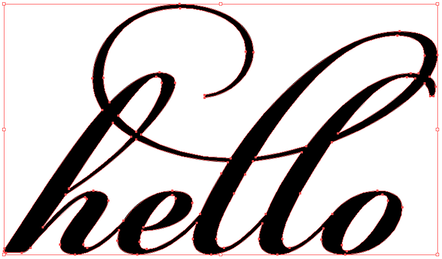
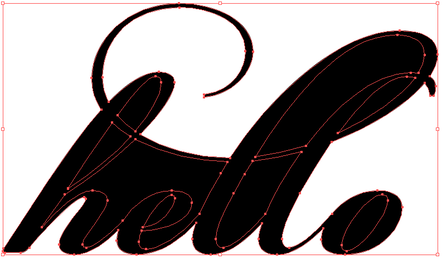
One of the critical pieces of making a design work in the physical work is paying attention to bridges — paths that cross gaps in your design to hold it together. A potential client is working on a gatefold envelopment for an invitation. She’d like to have some text cut out of the gatefold; that is, the text is negative space. We start our design by just typing in the text:

Without any changes, we’d end up with something like this:

Now it’s obvious that some bridges need to be added to the design. We’ll start by adding bridges (or rather, removing part of the design) to connect every island, like so:
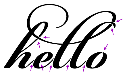
Now the design looks like we intended when cut:

However, there is still a problem. Imagine taking your finger and pushing on different parts of the cut piece, for example, the middle of the “o”. This piece is quite floppy, making it likely to shift around, get pushed in and out and ultimately tear off. We could make the bridges really wide, but we risk throwing off the balance of the design or ruin the legibility. To reinforce the islands, we instead add more bridges:
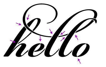
Finally we have a design that looks good and is structurally sound:

I am of course happy to take your money in exchange for doing this work for you. I’ll make the needed changes, cut a physical prototype, photograph it for your approval, and send back the modified file.
Cut from Paper Source in White and Stardream in Rose Quartz with coordinating 5 3/4” square envelope. Ink-free etched text.
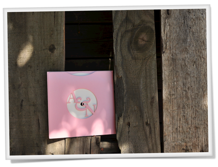
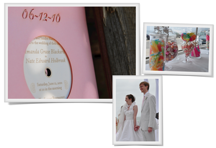
My brother-in-law Nate was recently married to his high school sweetheart Amanda and I was delighted to design their wedding invitations.
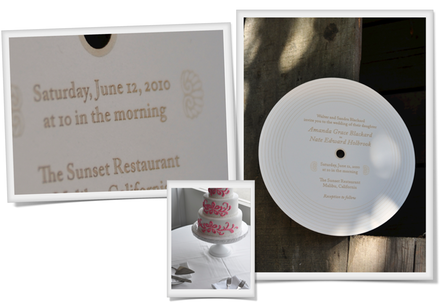
A vinyl aficionado, Nate brought up the idea of making a mock-record invitation. I photographed and emailed several choices of paper to match their pink and white theme and they went with my favorite, a pearlescent rose. Spending some time on record sleeve production websites I came up with a good template that just required two strips of adhesive.
Perfecting the etching took the longest amount of time. I ultimately developed a technique that first etches the text, then finely outlines it to increase the contrast.
Heartfelt congratulations to the newlyweds. It was a joyous wedding with many sweet details.
If I made this invitation again I would make a few improvements. First, I’d change the font for the date. Perhaps adding bridges to the font used for the monogram would be enough. Second, I’d reverse-cut the sleeve so that the slight yellowing of the paper around the cuts would be on the inside instead of the outside. When I first did the cut it looked great; it wasn’t until a week or so later that the discoloration showed. Last, the white paper etched great (I tested at least eight whites from several mills) but it didn’t feel quite solid enough. It was somewhere in the 80-100# range; 120-140# would be much more record-like.
More photos are on flickr. This design is available to be customized for your special event from $5 an invite. I’m happy to work with your design or a third party designer as well, just email for more information or a quote.
Cut from Mohawk Beckett Cambric in Blazer Blue/White. Stitch-effect edge and rounded corners.
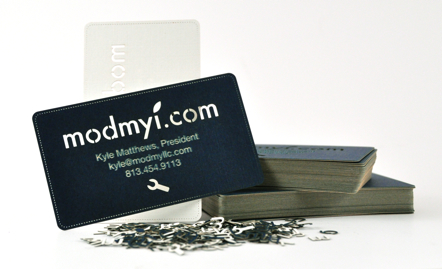
ModMyi is an Apple news site with community forums and downloads. Kyle contacted me about creating cards to bring to the upcoming Apple developer conference in San Francisco.


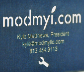
Using a vector file of their logo I created five design choices and tested a couple of duplex blue papers. The thicker 130lb paper with its delicate linen texture was a clear winner. Why duplex? For my own cards I’ve used a wide range of papers. I found that the dark papers were frustrating because I had nowhere to write. With a dark/light duplex the problem is solved by having the back of the card to write on.
After a lot of testing I found the precise setting so that the laser would burn away just the blue layer of the paper, leaving the white to give high contrast for the text. Unfortunately this paper is relatively smokey; I had to clean the lens of the laser between each sheet to maintain the optimal power.
The duplex engraving isn’t as legible as printed text but it’s a very unique look. Additionally, there are no plates to make, no ink to use, and no nasty chemicals to clean up the ink.
To complete the project I designed a custom box to match the cards. (I’m eyeing a copy of The Packaging and Design Templates Sourcebook to make this process faster.)
Additional photos are over in my flickr photostream. You too can own a swanky set of laser-cut business cards if you just email to get the ball rolling.