Kerf widths, inside cuts and Illustrator

Cutting art with fine details requires accounting for the kerf of the laser beam. The laser beam’s center follows the center of the vector path. Some material will be burned away; the width of the removed material is called the kerf.

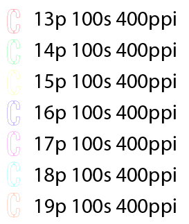
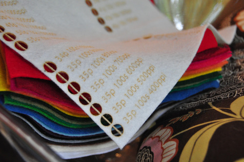
The kerf depends on a few factors, including the size of the lens, the type of the material, and the speed of the cut. For example, when cutting cardstock with a 1.5” lens a ULS 4.60 there is a 0.003” kerf on straight cuts and a 0.007” kerf on round cuts. Since the beam is centered, we only need to account for half of the kerf. In practice I’ve found that a 0.003” addition to the art allows for a good approximation of the original art.

Normally in Illustrator CS4 I use the appearance palette to add a Path->Offset Path… to account for the kerf. However, this doesn’t work correctly with inside cuts.

For example, from this art:

we would like to end up with a frame.

However, the kerf (purple) will cut from the exterior and interior, leaving a frame with a narrower width than intended.

Original art (two nested squares)

Desired cut (inner square cut from the outer, leaving a frame)

Frame narrower than intended

With Offset Path… only, both paths become larger.

The final frame is bigger all around.

Squares shown scaled up

Narrow scaled up frame

One easy change is to set the outer square to a positive offset, and the inner square to a negative offset. However, with complex artwork it is tedious to select every inner and outer cut separately.

Instead, select the cuts and use Object->Compound Path->Make. Then with the compound path selected apply the Offset Path.

Now the kerf is correctly accounted for and the desired frame is achieved.

Outer square has outer outline, inner square has inner outline

Final correct frame

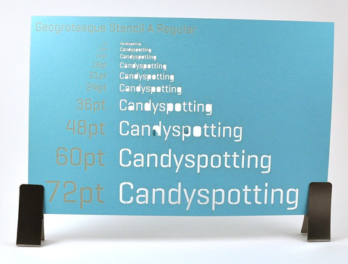
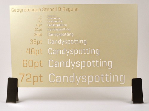
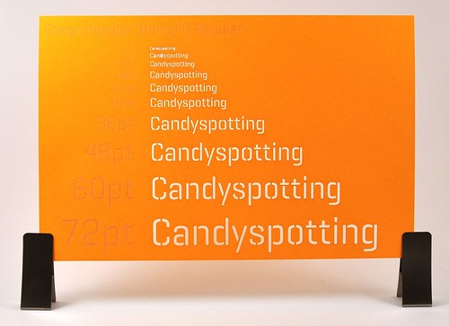
Candyspotting specializes in laser-cut paper. Contact me for a free estimate.

Inspiration – Chris Natrop

I’ve followed LA artist Chris Natrop for a couple of years. He makes stunning 3d installations often featuring cut paper.

Below is an image from his 2007 Pulse New York booth. Gorgeous! I’d love to see his pieces in person.

I’m lucky to have a friend who’s incredibly passionate about energy consumption. It makes me think about how my business and my family can reduce our draw. Since we have a baby in cloth diapers we start out pretty poorly — the washer, dryer, and dishwasher are run every day. We’ve made three recent changes to help our impact.

1. Replace the thermostat with an ecobee. I love our programmable thermostat. It makes it dead simple to keep the heat off or low when we don’t need it. Best of all, there’s an iPhone application so that when we’re out of the house we can remotely turn off the heat. It feels like the future when I can check the temperature of the house when I’m not inside it.

2. Go car-free. We were living “car light” for several years; we both used alternate forms of transportation to get to work. Portland’s public transportation is generally good and there are three Zipcars in walking distance from our house. We decided to sell the car and budget the money we would be spending on insurance for car rentals. Three months later, our son is much happier on the bus than strapped in his car seat, we don’t have the hassles of car ownership, and we get more fresh air! We’ve also successfully used Zipcar for a middle-of-the-night urgent care visit.

3. Sign up for energy offsets. Portland’s energy company, PGE, has a great program where you pay a bit extra to have your electricity offset with renewable energy. I like this program since it’s clear where the money is going. Most of the renewable source comes from wind. Who doesn’t love that? My laser was the motivator for signing up for this program. It doesn’t consume a huge amount of power, but it’s enough to make me conscious of it. I did some tests with a Kill A Watt with these results:

ULS 4.60 50W laser cutter

17W plugged in (“vampire” cost). The laser has a dedicated power outlet controlled by a switch, so I try to remember to turn it off.

86W turned on but not running

115W – 880W running – since it’s unusual for me to cut anything other than paper my actual usage is at the bottom of this scale. The few times I’ve cut acrylic or thick matboard I’ve had to crank up the power.

Quatro SPH-426 exhaust

107W – 128W. Again, this is normally at the lower end of the scale since I don’t need to run the exhaust at 100% when I’m just cutting paper. Since the exhaust is partway across the room I always turn it on and off via the dedicated wall switch, so I didn’t measure the vampire draw.

Up next? Insulating the garage and having a “blow test” done on the house.

Link:

Pretty laser-cut flipbooks. I wish they posted video of them in action.

The bridges of Geogrotesque Stencil

2010 CalendarGeogrotesque Stencil is the first font I’ve found that has different bridge widths for the same font size. I highly recommend this font for physical applications such as laser cutting. The bridge is the line that connects islands (typographic closed counters), for example the middle of the “o” or “a” that would fall out if they weren’t bridged. Most stencil fonts play it safe with fat bridges. Once the font gets to a certain size the bridge stands out and is wider than necessary to physically hold the island in place. With a choice you can get a nice balance between the bridge width and the font size.

Ideally the bridges would be parameterized so that I could adjust them the same way I can adjust leading or other type properties.

After some experimenting these are my recommendations:

Geogrotesque Stencil A for 60pt+

Geogrotesque Stencil B for 24pt – 60pt

Geogrotesque Stencil C for 14pt – 24pt

Below 14pt the islands fall out (65# paper).

Geogrotesque Stencil A Regular Geogrotesque Stencil B Regular Geogrotesque Stencil C Regular

2010 calendars featuring Geogrotesque Stencil are available in the shop. Convo me on Etsy if I don’t have any listed and you’d like one :).

It’s only fitting that my first video upload is shaky, poorly lit, and has a mystery time gap, but there you have it.

Beautiful stop-motion work with paper. (Via Jonah posting to my Facebook wall)

Illustrator graphic styles for ULS

Here’s a set of graphic styles you can use in Illustrator to take full advantage of the ULS print driver.

  1. Download Illustrator graphic styles for ULS laser
  2. Move them to ~/Library/Application Support/Adobe/Adobe Illustrator CS4/en_US/Graphic Styles
  3. In Illustrator, open Window->Graphic Styles
  4. Open Graphic Style Library->User Defined->uls

The top row of styles is for etching, the bottom for scoring and cutting. Once the job is in the ULS Control Panel you should see the same colors that were used in the document. If everything displays black instead, double check that the document is using RGB (File->Document Color Mode->RGB Color). If it’s not, change it to RGB and reapply the styles to the document.

When testing a new material I use every color to test as many settings as possible at once, like so:

Illustrator screenshot with 7 vector settings

Rastering the setting numbers takes extra time but it creates wonderful documented samples.

Laser cut felt showing the settings used