Common bridge problems

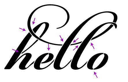
One of the critical pieces of making a design work in the physical work is paying attention to bridges — paths that cross gaps in your design to hold it together. A potential client is working on a gatefold envelopment for an invitation. She’d like to have some text cut out of the gatefold; that is, the text is negative space. We start our design by just typing in the text:

Without any changes, we’d end up with something like this:

Now it’s obvious that some bridges need to be added to the design. We’ll start by adding bridges (or rather, removing part of the design) to connect every island, like so:

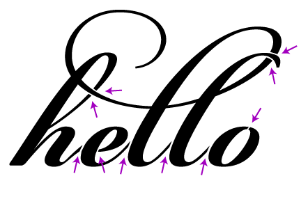
Now the design looks like we intended when cut:

However, there is still a problem. Imagine taking your finger and pushing on different parts of the cut piece, for example, the middle of the “o”. This piece is quite floppy, making it likely to shift around, get pushed in and out and ultimately tear off. We could make the bridges really wide, but we risk throwing off the balance of the design or ruin the legibility. To reinforce the islands, we instead add more bridges:

Finally we have a design that looks good and is structurally sound:

I am of course happy to take your money in exchange for doing this work for you. I’ll make the needed changes, cut a physical prototype, photograph it for your approval, and send back the modified file.

Freshly Cut – Amanda & Nate’s Wedding Invitations

Cut from Paper Source in White and Stardream in Rose Quartz with coordinating 5 3/4” square envelope. Ink-free etched text.

My brother-in-law Nate was recently married to his high school sweetheart Amanda and I was delighted to design their wedding invitations.

A vinyl aficionado, Nate brought up the idea of making a mock-record invitation. I photographed and emailed several choices of paper to match their pink and white theme and they went with my favorite, a pearlescent rose. Spending some time on record sleeve production websites I came up with a good template that just required two strips of adhesive.

Perfecting the etching took the longest amount of time. I ultimately developed a technique that first etches the text, then finely outlines it to increase the contrast.

Heartfelt congratulations to the newlyweds. It was a joyous wedding with many sweet details.

If I made this invitation again I would make a few improvements. First, I’d change the font for the date. Perhaps adding bridges to the font used for the monogram would be enough. Second, I’d reverse-cut the sleeve so that the slight yellowing of the paper around the cuts would be on the inside instead of the outside. When I first did the cut it looked great; it wasn’t until a week or so later that the discoloration showed. Last, the white paper etched great (I tested at least eight whites from several mills) but it didn’t feel quite solid enough. It was somewhere in the 80-100# range; 120-140# would be much more record-like.

More photos are on flickr. This design is available to be customized for your special event from $5 an invite. I’m happy to work with your design or a third party designer as well, just email for more information or a quote.