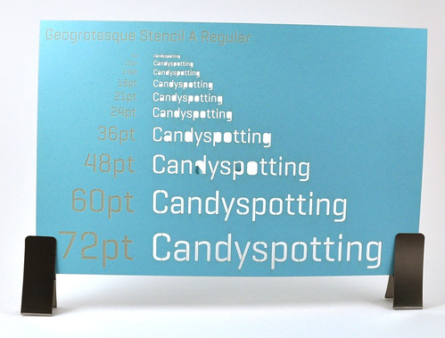
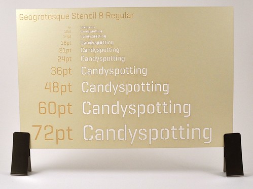
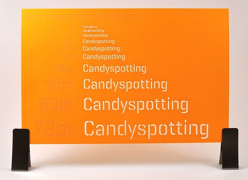
 Geogrotesque Stencil is the first font I’ve found that has different bridge widths for the same font size. I highly recommend this font for physical applications such as laser cutting. The bridge is the line that connects islands (typographic closed counters), for example the middle of the “o” or “a” that would fall out if they weren’t bridged. Most stencil fonts play it safe with fat bridges. Once the font gets to a certain size the bridge stands out and is wider than necessary to physically hold the island in place. With a choice you can get a nice balance between the bridge width and the font size.
Ideally the bridges would be parameterized so that I could adjust them the same way I can adjust leading or other type properties.
After some experimenting these are my recommendations:
Geogrotesque Stencil A for 60pt+
Geogrotesque Stencil B for 24pt – 60pt
Geogrotesque Stencil C for 14pt – 24pt
Below 14pt the islands fall out (65# paper).
2010 calendars featuring Geogrotesque Stencil are available in the shop. Convo me on Etsy if I don’t have any listed and you’d like one :).
